

INTRODUCTION
Dashboards are often created on-the-fly with data being added simply because there is some white space not being used. Different people in the company ask for different data to be displayed and soon the dashboard becomes hard to read and full of meaningless non-related information. When this happens, the dashboard is no longer useful.
WHO ARE YOU TRYING TO IMPRESS?
‘Does the CFO really need to know the servers are operating at 95% capacity?’
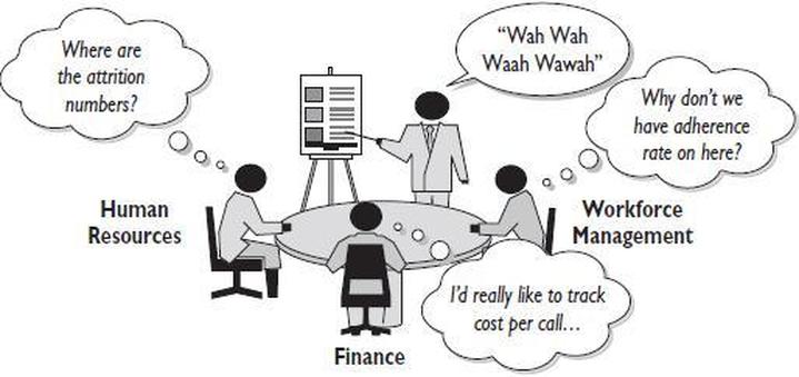
Think about the audience for the dashboard. The most effective dashboards target a single type of user and just display data specific to that ‘use case’. Is the dashboard going to be used by the executive team to monitor the company’s financials or will it be used by the marketing team to monitor daily activities? It’s important to ensure that where possible your dashboard consists of data that is specific to a single audience. Often this step is overlooked and dashboards include a mix of data: Some of which is relevant to one audience and some to another.
SELECT THE RIGHT TYPE OF DASHBOARD
There are 3 common types of dashboard, each performing a specific purpose:
- Operational
- Strategic / Executive
- Analytical
1. Operational Dashboards
These dashboards display data that facilitate the operational side of a business. For example, in a business with a website, it’s important to ensure that your website remains up and running, so you would monitor server uptime and utilization. In a business with an inside sales function, you may want to create a dedicated sales dashboard that displays a number of calls made and a number of appointments booked.
Think of an operational dashboard as monitoring the nerve center of your operation. Operational dashboards often require real-time or near real-time data
2. Strategic / Executive Dashboards
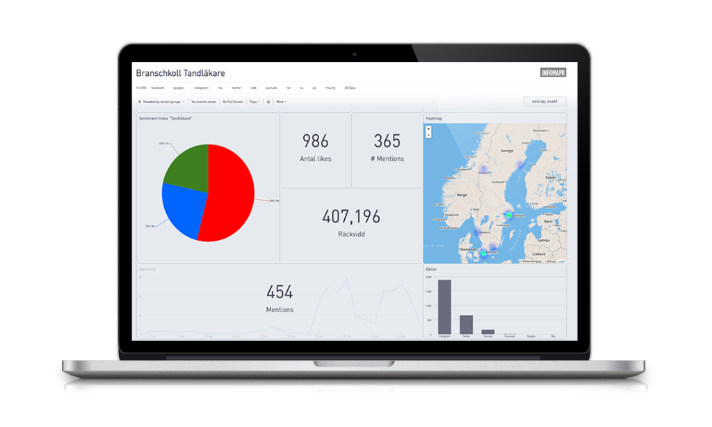
Strategic dashboards will typically provide the KPIs (Key Performance Indicators) that a company’s executive team track on a periodic (daily, weekly, or monthly basis). A strategic dashboard should provide the executive team with a high-level overview of the state of the business together with the opportunities the business faces.
This data could be:
- Periodic revenue (vs prior period)
- Costs (vs prior period)
- Headcount (by department)
- Sales pipeline
3. Analytical Dashboards
An analytical dashboard could display operational or strategic data. However, this type of dashboard will offer drill-down functionality – allowing the user to explore more of the data and get different insights. Often dashboards include this functionality when it is not required. Do not simply provide this functionality because you can.
Bear in mind that different user groups may require a different type of dashboard. The marketing manager may need both a Strategic and Operational view of their data. Where possible create two separate dashboards.
GROUP DATA LOGICALLY – USE SPACE WISELY
A well-designed dashboard will ensure that data is displayed in logical groups. For example, if a dashboard includes Financial KPIs and Sales Pipeline, ensure that the financial data is displayed next to each other, with the Sales Pipeline data displayed together in a separate logical group. Grouping is often by department or functional area and can include:
- Product (Inventory, development)
- Sales/Marketing
- Finance (Actuals and forecasts)
- People
Often the most important real-estate on a dashboard (top left-hand corner) is reserved for a company logo or a navigation tool. This is not good dashboard practice as the part of the screen is the most important part of your dashboard (this is because most western languages read from top to bottom and from left to right – hence our eye will start it’s journey when discovering something new at the top left-hand corner.
MAKE THE DATA RELEVANT TO THE AUDIENCE
An Executive dashboard can have a number of different audiences. Ensure that the data you display is relevant to the users. Think about the scope and reach of your data:
- The whole company
- By Department
- Individuals
- Suppliers
Ensure that you understand exactly who the intended audience is and the scope of their requirements. In a small organization, the Executive dashboard is likely to include KPI data across all departments. However, in a larger company, each department may have their own Executive dashboard.
Gaining agreement on dashboard components from non-related parties are doomed to fail.
DON’T CLUTTER YOUR DASHBOARD – PRESENT THE MOST IMPORTANT METRICS ONLY
Dashboards are often cluttered. Cluttered displays deflect the focus from the important messages. Some are cluttered with useful and relevant information and some are cluttered with useless and irrelevant information. Neither of these situations is desirable.
Each dashboard-type may require different amounts of data (for example an Executive dashboard may only need 6 numbers, whereas an Operational dashboard may need upwards of 20) There is no hard and fast rule to follow here, except ensuring that everything you display is relevant and meaningful to the audience. Do not add a graph or text simply because you can.
HOW OFTEN DOES THE DATA REALLY NEED TO BE REFRESHED?
Ensuring that your dashboard data is being refreshed at the right intervals saves time during development (why go through the pain of sourcing real-time data, when all you need is a weekly feed) and can ensure optimal performance once the dashboard is live.
Examples of refresh rates on dashboards include:
- Real-time (or near real-time)
- Daily, weekly, monthly
As a rule of thumb, operational dashboards require data in real-time or near real-time, whereas executive/strategic dashboards require data refreshed on a less frequent basis.

")


")


 on the Indian Economy")