
Client Background
Client: A leading marketing firm in the USA
Industry Type: Market Research
Services: Marketing, Consultancy
Organization Size: 60+
Project Objective
- Change bubble colors dynamically.
- Make table and charts linked. If a user clicks on tables values, then the bubble chart on the map should be highlighted that relates to the table.
Project Description
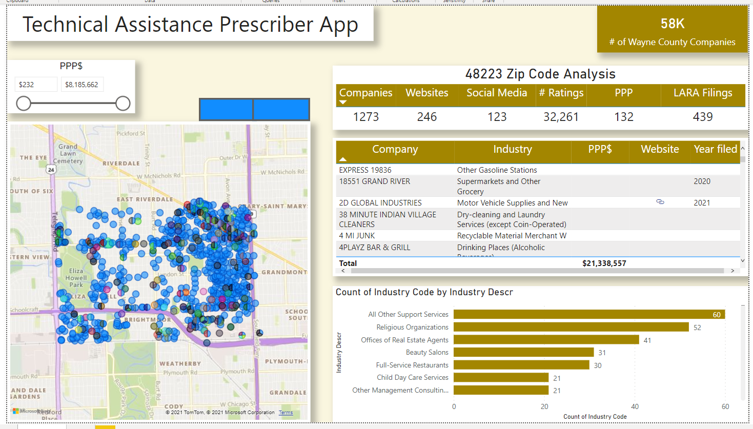
- “I have a map visual. I would like to dynamically change the colours of some of the bubbles.”
- The report page has several filters and KPI Dashboard, whose metrics change dynamically when the user clicks a certain element. Similarly the map should also change dynamically relative to the filter.
Our Solution
- Added the website data from Details table to the map visualization, it makes the bubbles get coloured dynamically according to the requirement for websites data.
Project Deliverables
- The Power BI ( .pbix ) file updated with solution
Tools used
- Power BI
Skills used
- Power BI
- Data Visualization
- Data Analysis
Databases used
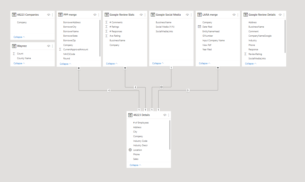
- The database that came in with the Power BI file received from client
What are the technical Challenges Faced during Project Execution
- The map was not linked
- Map Bubbles were not dynamic
How the Technical Challenges were Solved
- Refactoring the data model and using appropriate keys to link the data together
- That made Map to change according to Slicers/Filters
- To Change the colour, Bookmark buttons were used in the dashboard to bring up the dynamic colour changing with slicing (works after being published)
Project Snapshots