

Client Background
Client: A leading tech consutling in the USA
Industry Type: IT & Consulting
Products & Services: IT & Consulting
Organization Size: 100+
About the Client:
The client is an academic research institution and sports performance organization focused on enhancing the health and performance of NCAA Division I student-athletes. Their work centers on understanding the behavioral and environmental factors that influence nutritional habits, with a specific emphasis on nutritional self-efficacy. The objective is to generate data-driven insights that help coaches, nutritionists, and athletic programs design targeted interventions, improve dietary decision-making, and strengthen overall athlete well-being and performance outcomes.
The Problem
Collegiate athletes face unique challenges in maintaining optimal nutrition, which directly impacts their performance, recovery, and overall well-being. Despite access to nutritional education and resources, behavioral change often depends on self-efficacy—the confidence in one’s ability to make healthy dietary decisions.
The primary problem areas identified were:
- Variability in nutritional self-efficacy (NSE) influenced by gender, housing status, and geographical location.
- Limited understanding of how these factors interact to shape athletes’ dietary behaviors.
- Need for actionable insights to improve dietary practices and self-efficacy among NCAA DI student-athletes.
Our Solution
The study aimed to address these gaps by:
- Analyzing the determinants of nutritional self-efficacy, focusing on gender, housing status, and geographical location.
- Identifying relationships between these factors and nutritional food behaviors (NFB).
- Providing actionable insights for tailored interventions that could enhance athletes’ nutritional self-efficacy and behaviors.
The solution was based on quantitative data analysis using survey results from NCAA DI student-athletes, leveraging validated tools like the Modified Self-Efficacy Scale (MSES) and Rapid Eating and Activity Assessment for Participants – Shortened Version (REAP-S)
Solution Architecture
The solution followed a structured workflow:
3.1 Data Cleaning and Preparation
- Missing values exceeding 70% were removed to ensure dataset quality.
- Remaining missing values were imputed using mode replacement.
- The final dataset consisted of ~100 rows for analysis.
3.2 Analytical Framework
- Descriptive Analysis: Explored demographic patterns and summarized data characteristics.
- Chi-Square Tests: Identified significant associations between categorical variables.
- Regression Analysis: Tested hypotheses to establish relationships between NSE, NFB, and key factors like gender, housing, and geographical location.
3.3 Visualization
- Histograms, pie charts, scatter plots, and correlation matrices were used to visualize data trends and relationships.
- Diagnostic plots (e.g., residuals, leverage) ensured the robustness of regression models.
Methodology
The study employed the following step-by-step methodology:
4.1 Research Framework
- Dependent Variable: Nutritional food behaviors (NFB).
- Independent Variables:
- Nutritional self-efficacy (NSE).
- Gender (male, female).
- Housing status (on-campus, off-campus).
- Geographical location (regions of the U.S.).
4.2 Hypotheses
- H1: Positive NSE is directly related to positive NFB, controlling for gender, housing status, and geographical location.
- H0: There is no relationship between NSE and NFB when controlling for the same factors.
4.3 Survey Tools
- MSES: A 15-question scale assessing confidence in making healthy dietary choices across various scenarios.
- REAP-S: A 13-question tool evaluating dietary habits and quality using a 4-point Likert scale.
4.4 Analytical Techniques
- Chi-square tests to evaluate associations between categorical variables.
- Multiple regression analysis to quantify relationships and identify significant predictors of NFB.
Deliverables
1. Cleaned Dataset
- Description: A refined dataset of ~100 rows, free from outliers and inconsistencies, prepared for analysis. Missing data handled through established imputation methods.
- Format: CSV or Excel file.
2. Data Analysis Outputs
- Exploratory Data Analysis (EDA):
- Histograms, summary statistics, and correlation matrices.
- Visualizations stored in histogram_eda and summary tables.
- Chi-Square Test Results:
- Tables summarizing significant and non-significant associations between key variables (e.g., gender, housing, region) and nutritional behaviors.
- Regression Analysis Outputs:
- Regression model summary, including significant predictors, R-squared value, and p-values.
- Diagnostic plots (e.g., residual vs. fitted, leverage plots).
3. Visualizations
- Pie Charts: Visual representation of categorical data trends (e.g., housing type, gender distribution).
- Scatter Plots and Correlation Matrices: Show relationships between self-efficacy, food behaviors, and other variables.
- Diagnostic Plots: Regression analysis validation visualizations.
4. Statistical Reports
- Chi-Square Report:
- Summary of hypothesis tests with p-values and interpretations.
- Highlight of significant associations (e.g., skipping breakfast vs. breakfast confidence).
- Regression Analysis Report:
- Detailed interpretation of model results, including key findings like the significant influence of nutritional self-efficacy and gender on dietary behaviors.
5. Summary of Key Findings
- Concise document outlining significant results:
- Self-efficacy as the strongest predictor of nutritional behaviors.
- Gender differences and their implications.
- Limited impact of housing and geographical location.
6. Final Detailed Report
A comprehensive document structured as follows:
- Introduction: Background, problem statement, and objectives.
- Methodology: Detailed explanation of data collection, cleaning, and analysis techniques.
- Findings: Key results from chi-square and regression analyses.
- Conclusions: Insights on the relationship between NSE, gender, housing, and geographical location.
- Recommendations: Tailored intervention strategies for athletes.
- Appendices: Visualizations, statistical outputs, and cleaned dataset overview.
Tech Stack
- Tools used
- Jupyter notebooks
- Python libraries
- Panda
- Munpy
- Matplotlib/seaborn
- Scipy
- Statesmodels
- Data visualisation tools
- Language/techniques used
- Language used: Python
- Techniques:
- Data cleaning
- Descriptive statistics
- Chi Square analysis
- Regression analysis
- Diagnostic modelling
- Models used
- Statistical models
- Linear regression model
- Chi Square test
- Correlation analysis
- Skills used
- Data cleaning
- Statistical analysis
- Data visualization
- Problem solving
- Technical writing
- Databases used
- <Start writing from here>
- Web Cloud Servers used
- <Start writing from here>
What are the technical Challenges Faced during Project Execution
- Data Quality Issues
- Missing Values: The datasets contained a significant number of missing values, requiring careful handling. Rows with more than 70% missing data had to be dropped, and other missing values were imputed using the mode to preserve data integrity.
- Data Reduction: After cleaning, the dataset was reduced to ~100 rows, which may limit the generalizability of findings.
- Categorical vs. Numerical Data Integration
- Combining categorical and numerical datasets posed challenges in mapping values correctly to maintain consistency between variables, especially when assigning numerical values to survey responses.
- Statistical Analysis Complexity
- Chi-Square Test: Identifying meaningful associations among numerous categorical variables required careful selection and interpretation of results.
- Regression Analysis: Ensuring that assumptions for regression modeling (e.g., normality, homoscedasticity, multicollinearity) were met necessitated additional diagnostic plotting and validation.
- Survey Data Interpretation
- Responses from tools like MSES and REAP-S had subjective elements, which introduced variability in interpreting self-efficacy and behavior scores. This required careful calibration and standardization.
- Data Visualization
- Generating clear and meaningful visualizations to explain relationships between variables was challenging due to the diverse nature of the dataset (e.g., categorical vs. numerical data).
- Ensuring that visualizations were intuitive for non-technical stakeholders (like the client) added complexity.
- Small Sample Size
- The reduced dataset (~100 rows) limited the statistical power of the analysis, particularly when examining subgroup differences (e.g., by region, gender).
- Some hypotheses, like the effect of geographical location, could not yield conclusive results due to insufficient data diversity.
- Correlation vs. Causation
- Differentiating correlation from causation was critical, as statistical associations (e.g., between NSE and NFB) do not necessarily imply direct causation. Clear communication of this limitation was necessary to manage client expectations.
- Client-Specific Requirements
- Balancing the academic rigor of statistical methods with the practical needs and understanding of the client, a sports assistance professional, required simplifying complex findings without losing their essence.
- Tool Limitations
- The survey tool (Qualtrics) and analysis platform (Jupyter Notebooks) were not directly integrated, requiring additional effort in data import/export and preprocessing.
- Time Constraints
- The project had a tight timeline, necessitating efficient execution of cleaning, analysis, and reporting tasks while maintaining accuracy and detail.
How the Technical Challenges were Solved
- Handling Missing Values
- Threshold-Based Row Removal: Rows with more than 70% missing data were dropped to ensure sufficient data for analysis.
- Mode Imputation: Missing values in the remaining data were replaced with the mode to retain as much information as possible while preserving the dataset’s structure.
- Integration of Categorical and Numerical Data
- Mapping Choices to Values: A systematic mapping of numerical codes to categorical choices was implemented during data preprocessing, ensuring consistency across datasets.
- Cross-Validation: The mappings were validated by reviewing survey questions and response categories to eliminate misinterpretation.
- Statistical Analysis Optimization
- Chi-Square Tests: Significant relationships between variables were identified using chi-square tests. Marginally significant results were flagged for further exploration in future studies.
- Regression Diagnostics: Diagnostic plots (residual vs. fitted, Q-Q plots) were used to confirm that the assumptions of the regression model were met, ensuring the reliability of results.
- Survey Data Interpretation
- Standardization: Responses from tools like MSES and REAP-S were converted into standardized scores to compare self-efficacy and behavior more consistently.
- Clustering and Categorization: Behavioral patterns were categorized into broader trends to simplify interpretation without losing detail.
- Improved Data Visualization
- Tool-Specific Visualization: Tools like Matplotlib and Seaborn were used for creating intuitive plots (e.g., scatter plots, pie charts) tailored to the client’s understanding.
- Exploratory Visualization: Multiple visualization approaches were tested to identify the most impactful representations, such as the correlation matrix and trend lines.
- Addressing Small Sample Size
- Focus on Significant Trends: Despite the limited sample size, analyses concentrated on robust and significant relationships, such as the impact of NSE on NFB.
- Generalization Caveats: Results were clearly communicated as exploratory, with recommendations for future research using larger datasets.
- Clarifying Correlation vs. Causation
- Transparency in Reporting: The distinction between statistical association and causation was emphasized in the final report to manage expectations and provide actionable insights without overgeneralization.
- Discussion of Contextual Factors: Findings were contextualized with references to prior research, enhancing interpretability.
- Client-Specific Adaptation
- Simplified Communication: The technical jargon was minimized in client-facing deliverables, focusing on actionable recommendations and visual summaries.
- Iterative Feedback: Regular updates and feedback sessions with the client ensured alignment with their needs and understanding.
- Tool Limitations
- Streamlined Workflows: Data import/export workflows were optimized between Qualtrics, Jupyter Notebooks, and visualization tools to reduce manual overhead.
- Custom Scripting: Python scripts automated repetitive tasks, such as data cleaning and visualization, saving time and ensuring consistency.
- Time Management
- Task Prioritization: The project was broken into milestones, focusing on cleaning, analysis, and reporting in sequence.
- Parallel Processing: Wherever possible, tasks (e.g., exploratory analysis and visualization) were conducted simultaneously to meet deadlines.
Project Snapshots
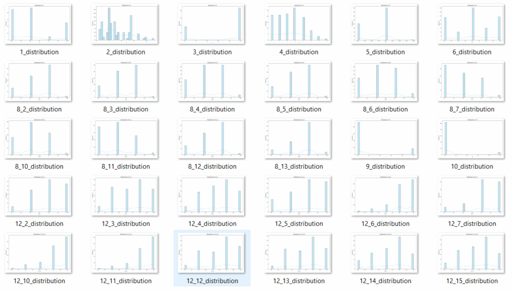
Img.1 Histogram
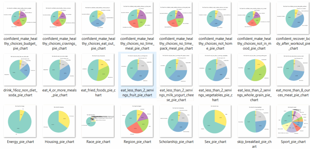
Img 2 Pie chart
Project Video
Contact Details
This solution was designed and developed by Blackcoffer Team
Here are my contact details:
Firm Name: Blackcoffer Pvt. Ltd.
Firm Website: www.blackcoffer.com
Firm Address: 4/2, E-Extension, Shaym Vihar Phase 1, New Delhi 110043
Email: ajay@blackcoffer.com
WhatsApp: +91 9717367468
Telegram: @asbidyarthy


")


 to PowerBI")
")


